Every website contains some images, videos and a Navbar at the top. They should all be responsive i.e. fits to every screen sizes. And for this purpose we use Bootstrap framework.
In this tutorial I will explain all these things from scratch and help you to make every Image, Video and Navbar mobile friendly using Bootstrap 4.
If you are a beginner in Bootstrap 4 then I would recommend to first read the below tutorial:
Bootstrap Responsive Image
The images whose original sizes are bigger than the screen width of the viewing machine have to be resized. For this we make them responsive using Bootstrap.
Suppose if the width of the image is 500 pixels. When viewing it on iPhone 8 (whose screen width is 375 pixels) then Bootstrap will resize this image to a smaller size and thus making it to fit on the iPhone’s screen.
To be more precise the width of the image is scaled down according to the column’s width where it is placed.
To make Responsive image with Bootstrap you just have to place img-fluid class on the img tag:
<img src="bigphoto.jpg" class="img-fluid" alt="bootstrap responsive image"/>When the img-fluid class applied to the image, Bootstrap automatically applies the CSS Media Queries to the image for different screen sizes.


Small images like icons have much smaller width than any smartphone’s screen so it is of no use to resize them. Therefore don’t apply img-fluid class to small size images.
Bootstrap Responsive Video
We can put a video in a web page either by using <video> tag or embed it from other sites like Youtube.
We can embed the videos by using the following 3 tags which are – <iframe>, <embed>, <video> or <object> tags.
To make a video responsive place it inside a div that has the two classes:
- 1. embed-responsive
- 2. embed-responsive-21by9 or embed-responsive-16by9 or embed-responsive-4by3 or embed-responsive-1by1
We can give the video either the aspect ratio of 4×3 (by embed-responsive-4by3 class) or 16×9 (by embed-responsive-16by9 class) and so on.
Also provide the video element embed-responsive-item class.
Example: Let us embed a Youtube Video and make it responsive using Bootstrap. For this copy the embed code from Youtube and apply the necessary bootstrap classes to it. The code will look like:
<div class="embed-responsive embed-responsive-16by9">
    <iframe class="embed-responsive-item" width="560" height="315" src="https://www.youtube.com/embed/lfFo_SwmRa4" frameborder="0" allowfullscreen></iframe>
</div>


We all use videos in our website and mostly embed them from Youtube so like images they also need to be made responsive.
For Bootstrap 5.0 and later
Use class ratio ratio-16×9 for providing responsiveness to iframes and videos. Here “ratio-16×9” is the aspect ratio. You can have 4 differnt classes for aspect ratios which are ratio-1×1, ratio-4×3, ratio-16×9 and ratio-21×9. In the below example I am using 4×3 aspect ratio.
<div class="ratio ratio-4x3">
    <iframe class="embed-responsive-item" width="560" height="315" src="https://www.youtube.com/embed/lfFo_SwmRa4" frameborder="0" allowfullscreen></iframe>
</div>
Bootstrap Navbar
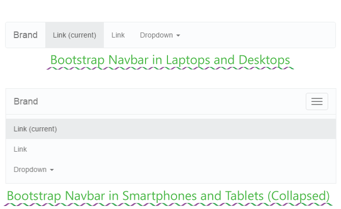
Bootstrap Navbar (Navigation Bar) can be used to create a responsive menu at the top of the website. The Navbar shows up completely on laptops and desktops but on smaller screens of tablets and smartphones, it appears collapsed.
When collapsed it is provided with a toggle button, on clicking this button the Navbar expands.
The HTML Code of Bootstrap Navbar is given below:
<nav class="navbar navbar-expand-lg navbar-light bg-light">
  <div class="container-fluid">
    <a class="navbar-brand" href="#">Navbar</a>
    <button class="navbar-toggler" type="button" data-bs-toggle="collapse" data-bs-target="#navbarSupportedContent" aria-controls="navbarSupportedContent" aria-expanded="false" aria-label="Toggle navigation">
      <span class="navbar-toggler-icon"></span>
    </button>
    <div class="collapse navbar-collapse" id="navbarSupportedContent">
      <ul class="navbar-nav me-auto mb-2 mb-lg-0">
        <li class="nav-item">
          <a class="nav-link active" aria-current="page" href="#">Home</a>
        </li>
        <li class="nav-item">
          <a class="nav-link" href="#">Link</a>
        </li>
        <li class="nav-item dropdown">
          <a class="nav-link dropdown-toggle" href="#" id="navbarDropdown" role="button" data-bs-toggle="dropdown" aria-expanded="false">
            Dropdown
          </a>
          <ul class="dropdown-menu" aria-labelledby="navbarDropdown">
            <li><a class="dropdown-item" href="#">Action</a></li>
            <li><a class="dropdown-item" href="#">Another action</a></li>
            <li><hr class="dropdown-divider"></li>
            <li><a class="dropdown-item" href="#">Something else here</a></li>
          </ul>
        </li>
        <li class="nav-item">
          <a class="nav-link disabled" href="#" tabindex="-1" aria-disabled="true">Disabled</a>
        </li>
      </ul>
      <form class="d-flex">
        <input class="form-control me-2" type="search" placeholder="Search" aria-label="Search">
        <button class="btn btn-outline-success" type="submit">Search</button>
      </form>
    </div>
  </div>
</nav>
The most important thing to note in the above code is to put the website links inside the <ul class=”navbar-nav”> tag.
The below image shows how the Bootstrap Navbar looks in big and small screens.

All websites uses Images, Videos and Navbar in their different pages so it is important that you should also apply Bootstrap responsive features into these three things. The purpose of this tutorial is to make you comfortable with important areas of Bootstrap and I hope it accomplishes it.
Please share this tutorial with your friends and give it the necessary exposure. Thank You!
The post How to Use Bootstrap to Make Images, Videos and Navbar Responsive appeared first on YogiHosting.